TVL Data Quality Dashboard
09.2017 / San Francisco
TurValue Labs is an alternative financial data provider who supplies their clients with the bussiness-related, sustainability and ESG insights drawn from the current events.
This dashboard is an internal tool for monitoring the quality of TruValue Lab’s self-generated and AI-powered data.
It enable data analysts to drill down into details and identify the gap to fill; It also provides a high-level overview for leaderships.
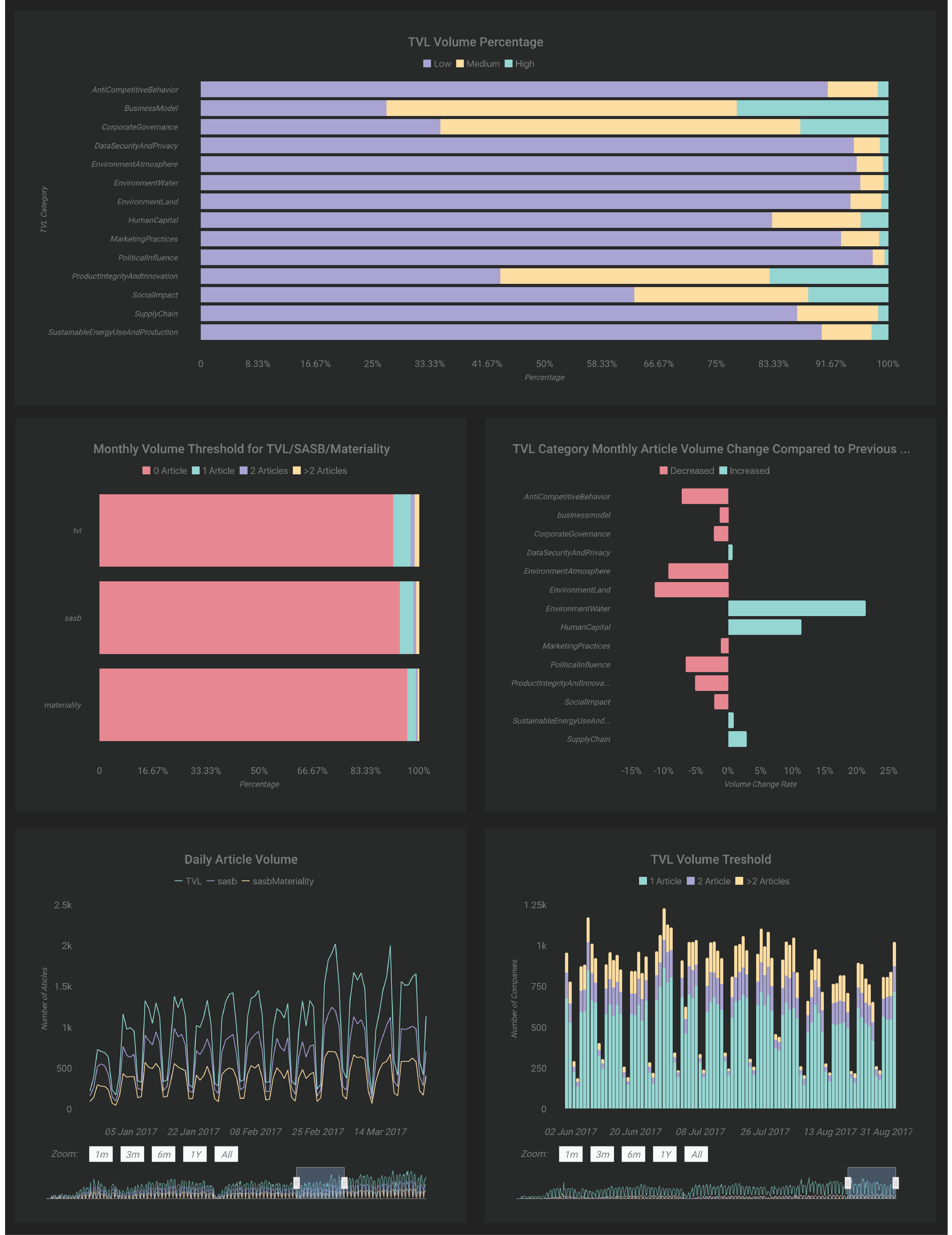
To leverage TVL's data quality, there are several phases thorughout the whole NLP pipline. This dashboard mainly focused on answering the questions related to the data and it's volume that are ingested into the system at the very initial stage.
1.draft product proposal
A product proposal listed out a spectrum of tools that could be used to create this data dashboard. After discussions with the Design and Product Lead and the Engineering Team with pros and cons of each plans, we decided to use a third party business intelligence tool instead of acquiring any extra input from the engineering team given the nature of a start-up environment.
2.understand the task domain and the audience
A major challenge of building this data quality dashboard is how to accurately translate high dimensional data with complex meanings into simple and intuitive result charts as to serve the full spectrum of audiences. Thus the first thing is to understand the task domain by communciating with the data scientists and reading the white papers which theoritically explained the algorithm. Interviewing and studying my audiences was also vital. By constantly asking them about the answers they expect to find from this datashboard and and their habbits of reading charts, the most efficient visual encoding for each questions could be consolidated.
3.clean the data
The understanding of the task domain went parallel with the process to playing with the data pulled from the internal data API. Given the capacities of the dashboarding tool, I transformed the origianl data structure into a more finite one as to better facilitate performance of the tool.
4.UI/UX design
With more than 60 diagrams on hand that has been visualized through the dashboarding tool, I grouped them into four different categories based on the type of insights they generated and displayed them on separate pages that the users can toggle between. Besides, a monthly data quality overview page was shown on the landing page which compares some of the KPIs of this month with the previous one.Visual tweaks for colors and overall layout were made to keep the data dashboard visually on brand.
5.QA
I worked closely with data scientist to QA the node.js and python scripts I wrote for parsing the data. We also tested the quality of pulls from data API to ensure that the data source is working correctly.
_development tools:
python, node.js